
Design system
Every page is built only from these parts. If something isn't here, it isn't on the site.
Colour
Brand
#2049a0
Brand tint
#eef2fa
Ink
#1d1d1f
Ink 2
#424245
Muted
#636366
Background
#f5f5f7
Card
#ffffff
Line
#e5e5ea
Success
#1b7f3b
Warning
#9a5b00
Danger
#c42b1c
Dark band
#1d1d1f
Type · Inter
Display
Heading 1
Heading 2
Heading 3
Lead paragraph, for page introductions.
Body text for reading. 16px, 1.5 line height.
UI text for labels and titles in components.
Small text for secondary details.
Eyebrow
Shape
- Controls
- 12px radius — buttons, inputs, dropdowns, option cards
- Cards
- 20px radius, one shadow
- Media wells
- 14px radius, background #f5f5f7
- Pills
- Chips (category tabs) and badges only
- Heights
- 36 · 44 · 52 for buttons; 48 for form fields
Buttons
Form controls
Hint text sits under the field.
Dropdown (form size)
Dropdown with prices
Dropdown (toolbar size)
NeutralBrandIn stockOnly 2 left
Information notice.
Warning notice.
Cards
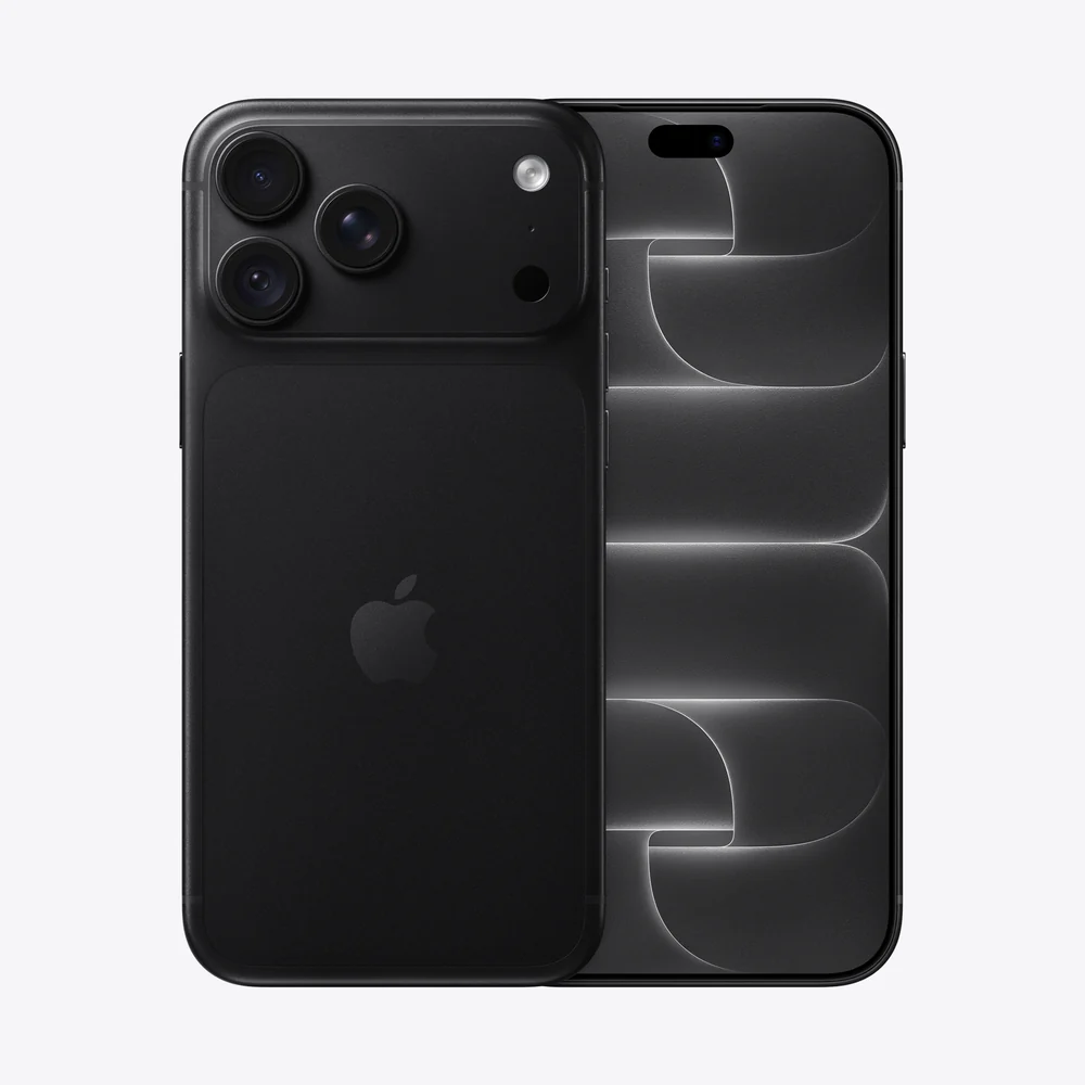 New
NewApple
iPhone 17 Pro
From Rs. 389,900
or 3 × Rs. 129,967 interest-free
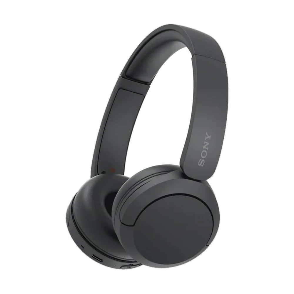 Save Rs. 3,000
Sony
Sony WH-CH520
Rs. 17,900Rs. 20,900
or 3 × Rs. 5,967 interest-free
Feature card
Icon, title, one line.
Row list
Icon, title, detail
Row list
Icon, title, detail